Pop up Store Berlin_DE
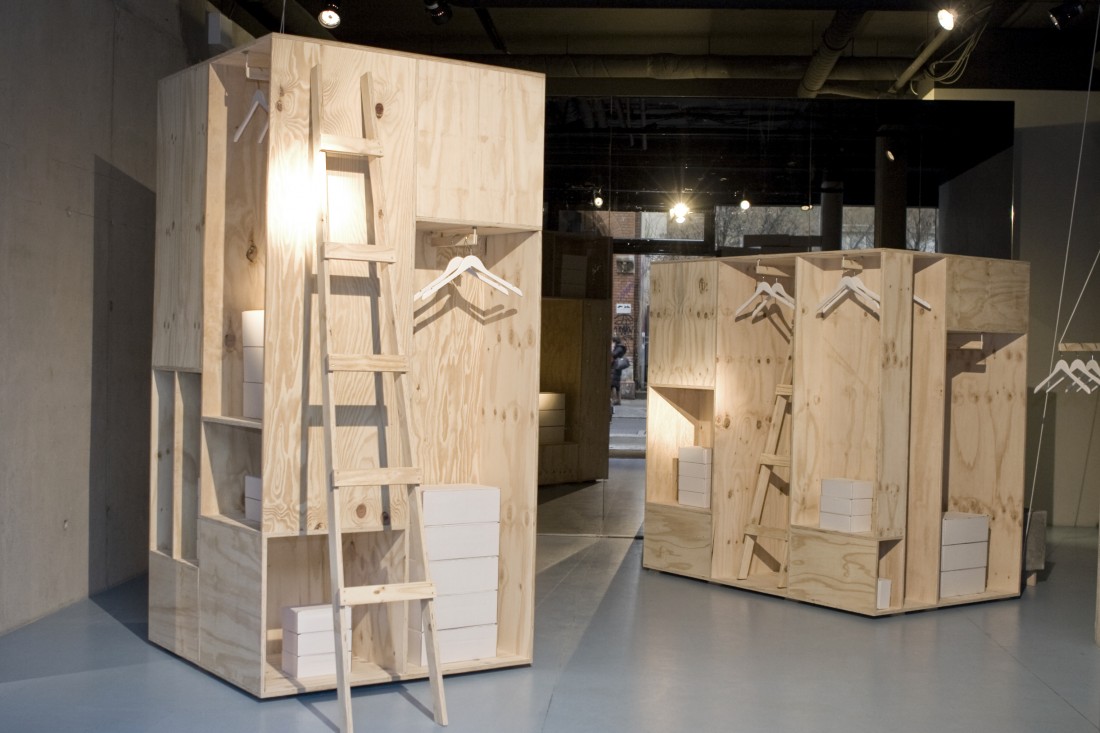
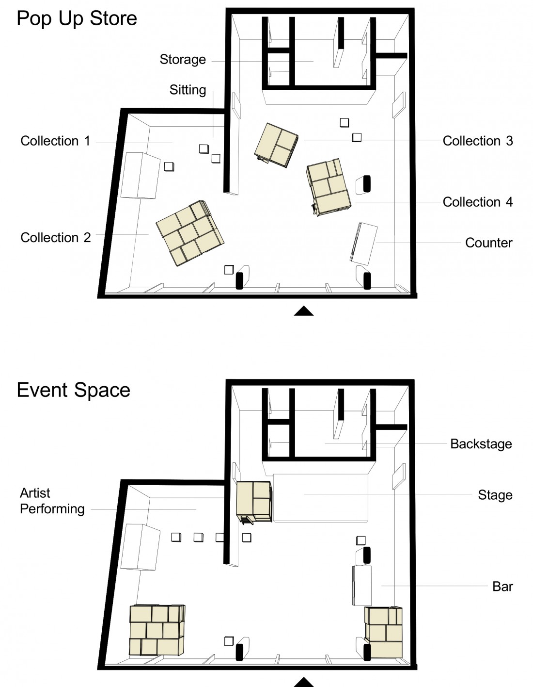
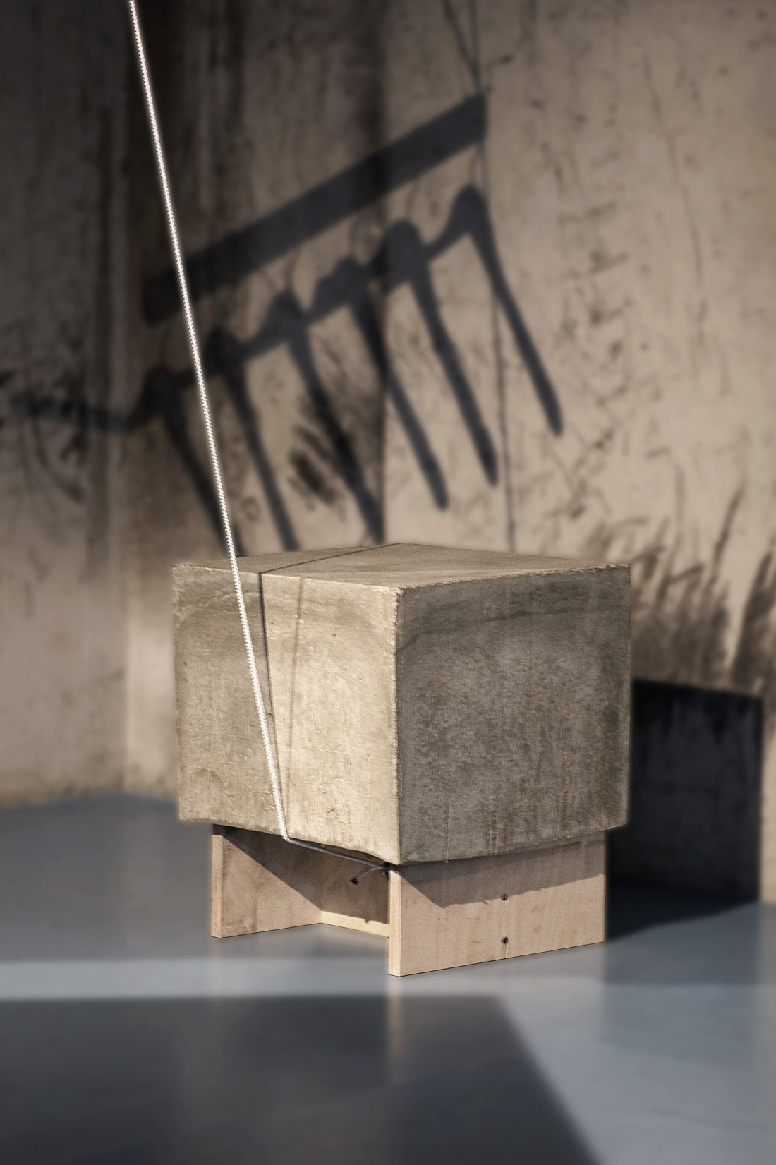
Inspired by the large wooden crates used in the shipping industry, the design for Zalando’s Pop-Up Store features three free-standing boxes, each revealing a seperate collection. The boxes are placed at angles to the concrete walls, guiding the visitor through the space as they discover the assorted rooms of the furniture. Concrete stools echo the materiality of the walls, and act as counterweights for the hangers of a fourth collection.
Prior to the opening of the Pop Up Store, stacks of white boxes used by the company to distribute goods covered the windows. Over time the facade of white boxes will disintegrate, revealing the content of the shop day by day.
- Location
- Weinmeisterstraße 2, Berlin - Mitte
- Year
- 2012
- Client
- Zalando Collection
- Photos
- Gonzalo Baro


